Mandy Wu
PortfolioAboutResume

Website Design

Philo Cards

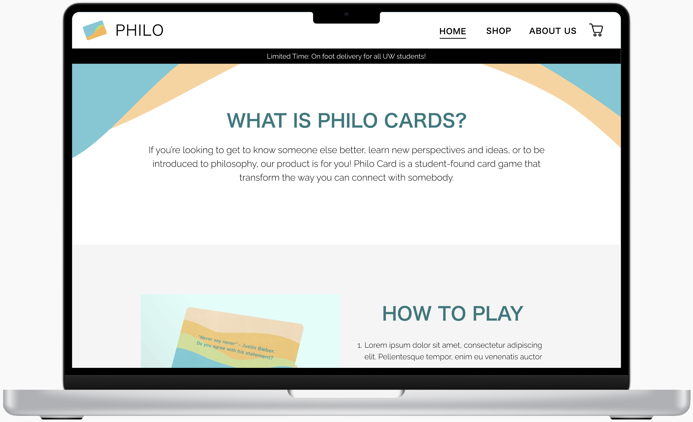
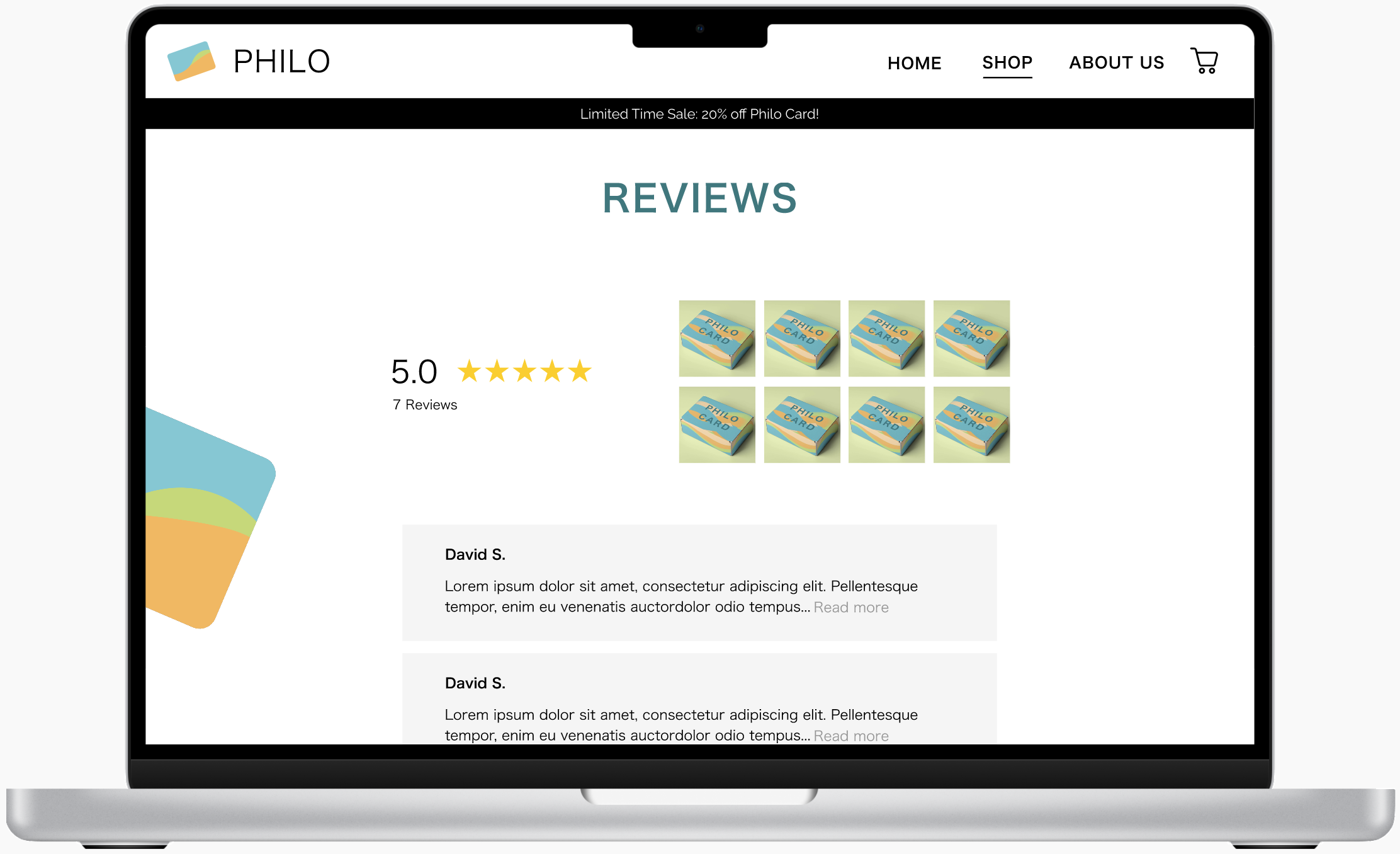
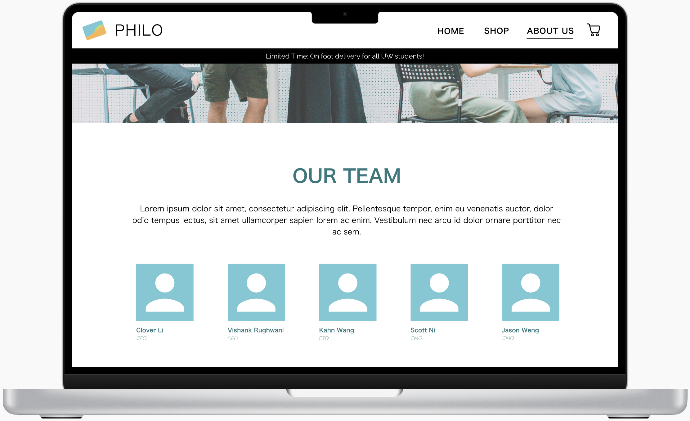
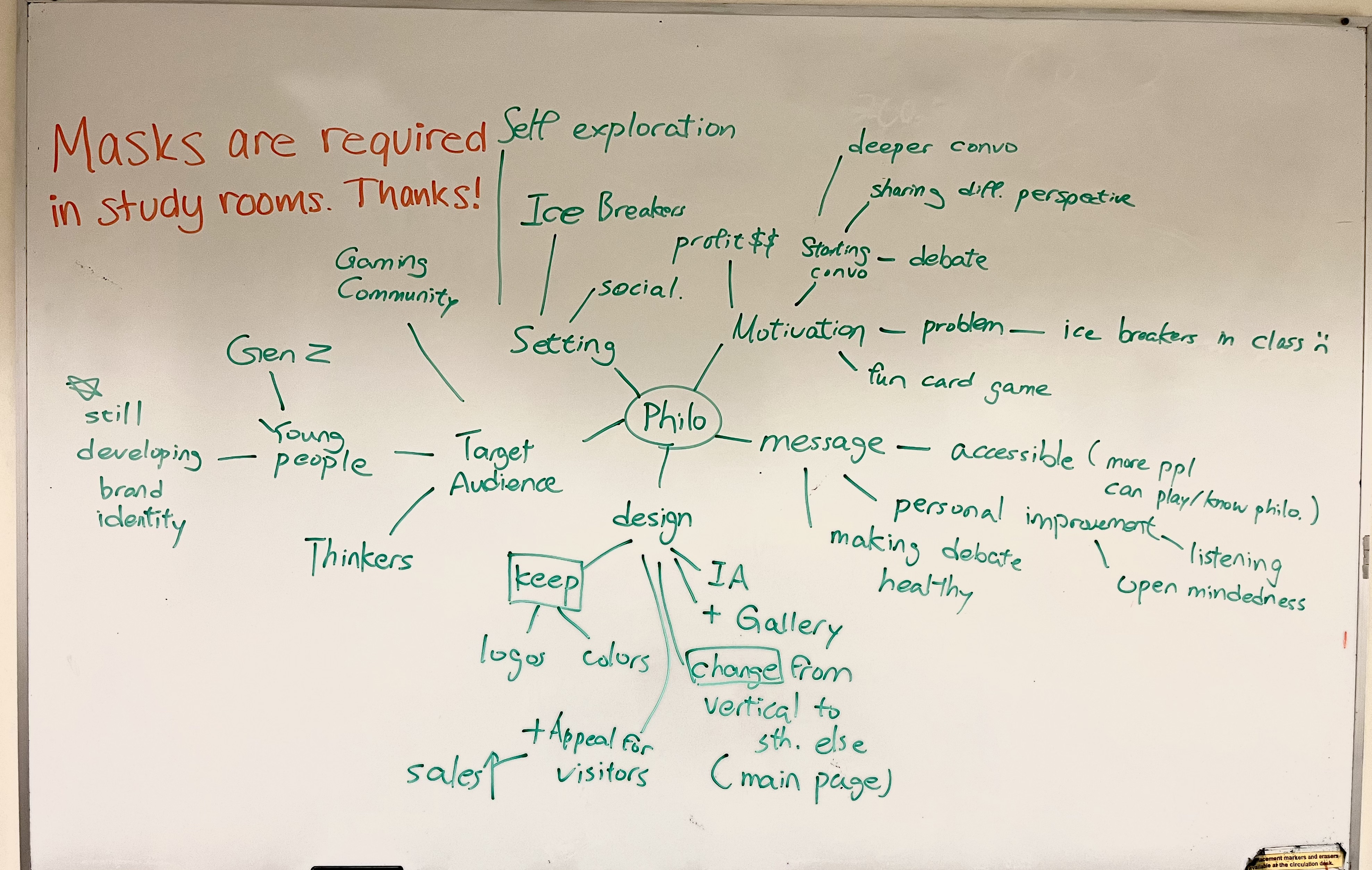
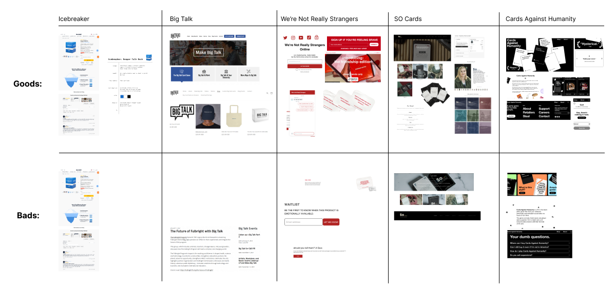
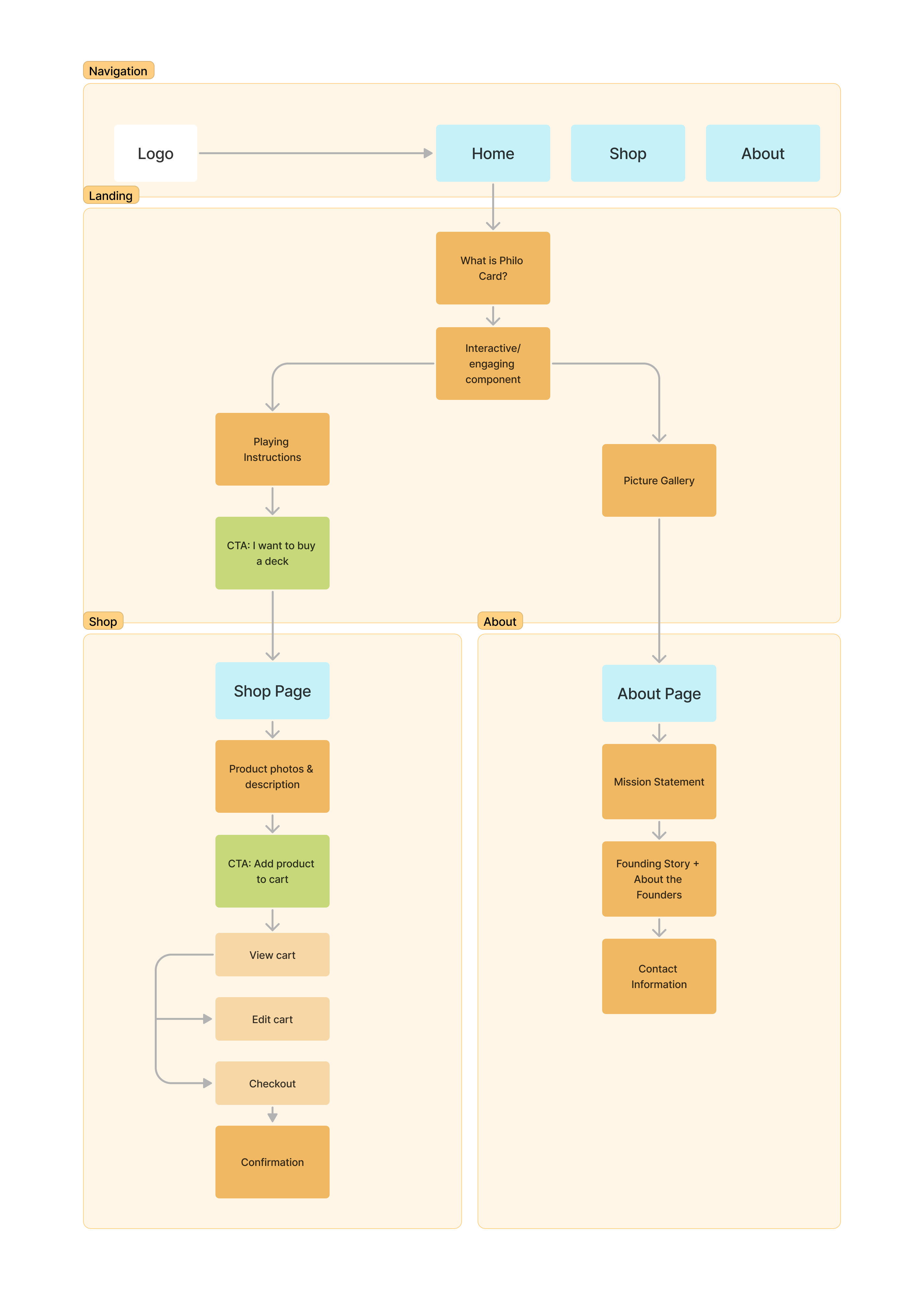
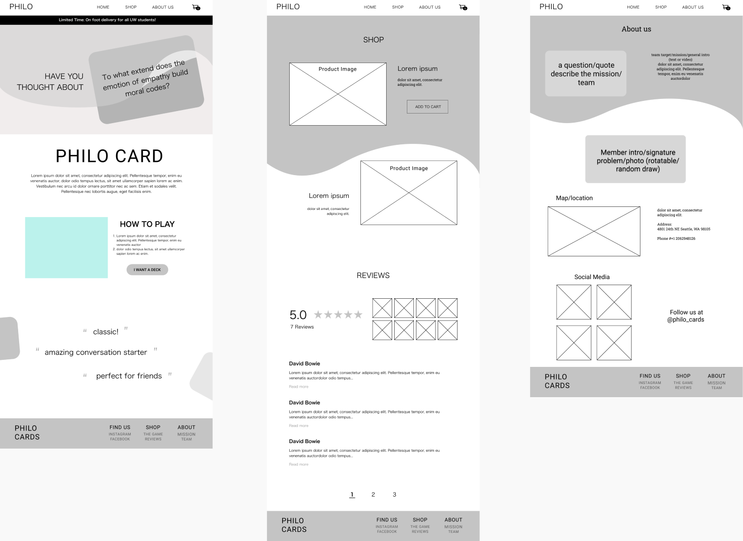
Philo Cards is a student-startup company founded at the University of Washington. We re-designed a website for their product with the goal of promoting their values and business, as well as provide an accessible platform for customers to purchase a deck of Philo Cards.

Duration:

5 weeks

Role:

UX Designer

Team:

5 Designers

Tools:

Figma, FigJam, Miro, Pen & paper

Problem

The original website for Philo Cards did not reflect the vibrant and imaginative aesthetic of the brand. In addition, there was a lack of organization for the site, which prompted difficulties navigating the page despite the minimal functions available.

The goal of the redesign is to better reflect the brand image, as well as create a smoother user experience for customers.

Solution

After researching and ideating, we created a new website that offers a fresh landscape to represent the brand identity. We also reorganized the flow of the website by separating the three main goals of the site into respective pages, offering a smoother navigation process for visitors.

Research

We kickstarted our project with a client interview to seek out their needs and desires with the new Philo Cards website. With what we learned, we created a mind map that focalizes the goal of the website in order to guide us through the design proceess.

Because we were redesigning a pre-existing website for a client rather than creating a product from scratch, we chose to focus on researching competitor products. In our informal competitor analysis, we researched five different products that were similar to Philo Cards, and noted the well and poor designs on their website. We then compiled our findings on a spreadsheet to find general design patterns that we wanted to follow, as well as design flaws that we wanted to avoid.

Information Architecture

To start, we made a list of features that could possibly be on the site. This was largely taken from features on the pre-existing sites, additional functions our client wanted us to impelement, and cool add-ons that we found through our competitor analysis. Then, we organized these on a MoSCoW chart to identify which features are the most important and which are the least. This map was adjusted many times based on further research and user interviews, and after we had a well-refined list, we organized it into our site map.

In our site map, we organized the different features we wanted to include in a way that best represents the flow of the map. This helped us set up the design of each page while maintaining overall functionality of the site.

Design

Low-Fidelity Prototype:

With our lo-fi prototypes, we conducted usability testing to determine how we can improve our design, then used our findings to translate the low-fidelity mockups to high-fidelity prototypes.

As we worked on the high-fidelity prototypes, we developed a style guide to ensure consistency across the different pages. We chose brighter iterations of the colors that the client originally had to convey a upbeat atmosphere, and selected typography that also reflected the vibrant feeling while still being legible.

High-Fidelity Interactive Prototype:

Let's connect!
EmailLinkedIn